Welcome to Pia Frauss' Fonts!
down
| Welcome to Pia Frauss' Fonts! | page down |
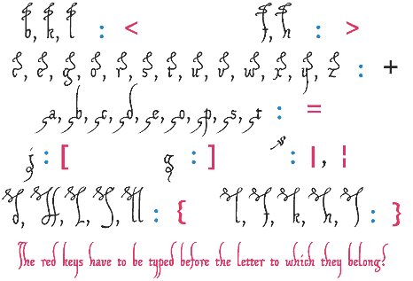
The XIPAROS font is sort of an extract of some German charters issued nine hundred years ago by one Henry, about whom I know nothing, apart from his being the last of the Salic kings, and his obstinate refusal to do an exact reckoning of his predecessors, calling himself the fourth of his name, while history Such charters, then, were written in Latin, and in a cursive hand that, to judge by its bewildering beginnings in the Carolingian age, seems to have developed out of the Roman cursive In structure, those charters appear pretty constant over the centuries. They begin and end with a formula displayed in what I shall now tentatively call a fence For all of those documents seem to have been penned in two minds. On the one hand, the clerks are wasting space by opening gap after gap between the lines, on the other they are determined to economize, by abriging all and sundry. And while they are producing blank after blank on the page, they seem obsessed with incurable horror vacui, struggling forever to fill those blanks by every means in their power. This is where the abbreviation signs come in handy. By 1100, their decorative value has outdone their purpose of conveying information. They are blossoming all over the page, reinforcing the impression of playfulness created by countless loops or zigzag lines meandering down the stems of ds, hs, etc., and sometimes even up the stems of ps and rs. I'd bet those loops and zigzag lines, when first surfacing, were abbreviation signs, too; but in Henry's time they merely disclose that the letter stems they adorn were felt to be too little space-taking. For sure, a few of those decorations have been included in the XIPAROS font. However, they aren't attached to the glyphs. With one exception, they have to be typed like accents before the glyphs to which they belong, and you'll have to go for them on the following keys:
The lower case letters of the XIPAROS font are rather genuine, if perhaps a bit more regular, and less edgy than the originals. However, I reduced the disproportions between upper and middle zone, and shortened the r to sit on the line. In Henry's charters, it's still reaching below, sometimes as far as the p; and I deemed this an horror-vacui-dictated anachronism not worth preserving. As for the upper case characters, I made them up myself out of the long s. The charters are indeed no great help there. Even the letters forming the fence aren't always clearly to be defined as capitals, and those few upper case characters contained in the texts are rather mixed: sometimes borrowed from contemporary book hands, sometimes resembling Roman capitals, sometimes Lombardic ones, and sometimes as steep and narrow and distorted as to match the fence's writing. I've gone along with the latter, though there weren't enough of them to form an alphabet. Of course, I can't swear to all of my upper case creations, but some of them come pretty close to what I've seen in the texts. Update 2010 has redesigned all of the composite glyphs (correcting the dcaron, Lcaron/lcaron, and tcaron), and enlarged the dashes. |
 |
top of page |
| Home Xenippa XalTerion EtBoemieRex | FranciscoLucas XiparosLombard Love'sLabour MitreSquare | JaneAusten Xirwena DeiGratia SonOfTime | Tagettes MalaTesta _a e i o u Tycho'sElegy | WirWenzlaw XiBeronne Tycho'sRecipe |
| Conditions of Use | Contact | Impressum |
| Please complete the address in your mail form with a-frauss.de | ||
| As long as you can put up with an English reply, you may write to me in French, Italian, Portuguese, or Spanish. German mail will be answered in German. | ||
| pd | ||
| top of page | ||