Welcome to Pia Frauss' Fonts!
down
| Welcome to Pia Frauss' Fonts! | page down |
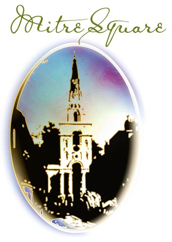
This rather dainty font has a rather sinister background Luckily, this copy has come upon us, and a facsimile of it is included in that fascinating folder "Jack the Ripper and the Whitechapel murders. The true story through contemporary documents", edited by Stewart P Evans and Keith Skinner (Public Record Office/The National Archives). At least, for my part, I was fascinated by the discovery that the Ripper case has more to offer than heaps of lousy scrawls, scribbled lefthandedly by greedy tabloid editors, unscrupulous hacks, and giggling perverts -- all of them eagerly trying to pass themselves off as a serial killer who is very much in control of his hand when using a knife, but for the life of him can't produce a straight stroke when holding a pen (and, believe me, even the Lusk Letter is as fake as they come). I'd never have bothered with any of their concoctions. The McWilliam report is quite a different matter. Whoever created that copy, had clearly calligraphic aspirations. Even among the other police reports in the folder, this one stands out as an aesthetic achievement, and a miracle of elaborate elegance. Moreover, when I chanced on that folder, I had been for some time in search of a pattern for a Victorian font -- since I'm not altogether happy with frequently seeing the JaneAusten font used as such. It's wrong on more than one level. For crying out loud, Jane Austen was Regency ... she was dead, and in her grave, before Queen Victoria was ever conceived! Worse, Jane Austen used quill pens to write May I plead with you, then, whenever you want to create a Victorian look by using one of my fonts, not to do an injustice to Jane Austen, but to go for the MitreSquare font instead (even though there is neither a famous name, nor, sadly, any name at all, attached to it)? Pretty please...? As for the font's characteristics, the McWilliam copist used two different es, and an amazing number of different ts. I've chosen the more frequent e, though it's the less conventional one, and have included as many differnt ts as I could cram into the font. On the other hand, I didn't go along with the copist's most frequent s On the number sign of the MitreSquare font, you'll find the copist's number sign (N°), for a change. The other alternate characters are
|
top of page |
| Home Xenippa XalTerion EtBoemieRex | FranciscoLucas XiparosLombard Love'sLabour MalaTesta | JaneAusten Xirwena DeiGratia SonOfTime | Tagettes Xiparos _a e i o u Tycho'sElegy | WirWenzlaw XiBeronne Tycho'sRecipe |
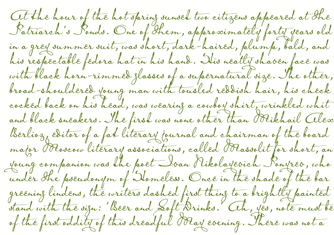
Opening paragraph of the novel The Master And Margarita by Michail A. Bulgakov;
English translation © Richard Pevear and Larissa Volokhonsky.
| Conditions of Use | Contact | Impressum |
| Please complete the address in your mail form with a-frauss.de | ||
| As long as you can put up with an English reply, you may write to me in French, Italian, Portuguese, or Spanish. German mail will be answered in German. | ||
| pd | ||
| top of page | ||